Managing visitors with an administrative portal

Summary
Designed the user experience for an administrative portal website to support a lobby check in tablet app that Signet offers. This website is to be used by receptionists and managers to conduct day-to-day tasks like keeping track of incoming visitors to larger administrative functions like customizing the check-in app.
With this purpose in mind, I carried out industry research and designed the app experience based on subject matter knowledge and the needs of stakeholders. I delivered low fidelity wireframes and collaborated with a visual designer for the final high-fidelity mockups shown at the bottom of this page.
Research
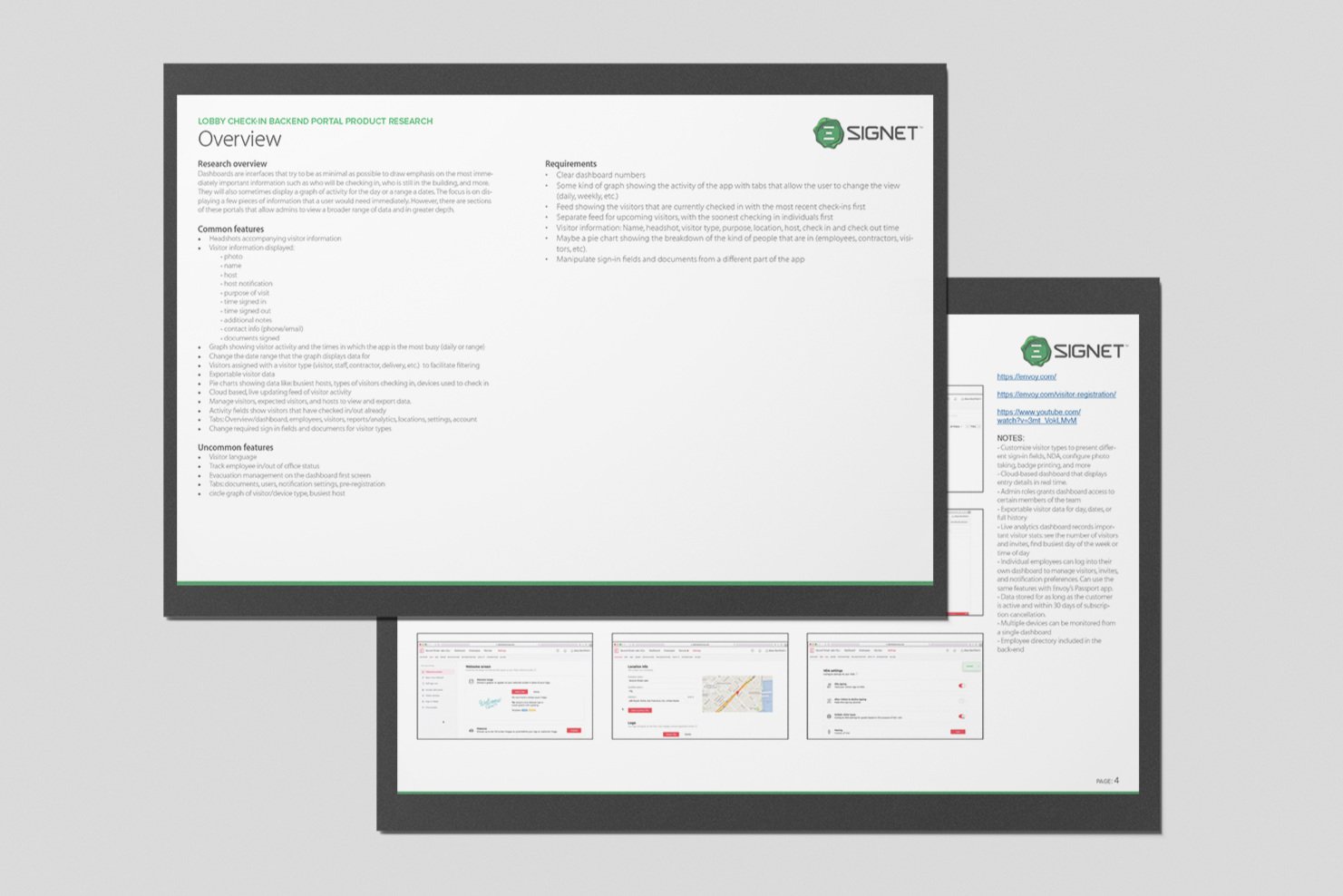
To better understand the competitive landscape as well as the features that would be useful for an minimum viable product for this admin portal, I conducted industry research. I looked at 10 competitors that offered a check-in solution and how they supported said solution with their own websites. I gathered information and insights by sourcing images and features from their product pages, support pages, and additional resource materials that they made available on their respective websites.
From there I defined a set of common and uncommon features that would inform initial requirements for this admin portal.
Common features:
Headshots accompanying visitor information
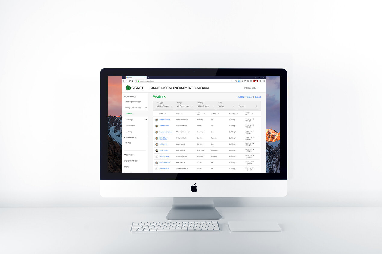
Visitor information displaying: photo, name, host name, purpose of visit, time signed in, time signed out, additional notes
Date range filters for analytics graphs
Activity fields that show which visitors have checked in/out
Charts showing data such as: busiest hosts, types of visitors checking in, devices used to check in, and more.
Uncommon features:
Visitor language
Employee in/out of office status
Evacuation management accessible through the homepage
Ideation
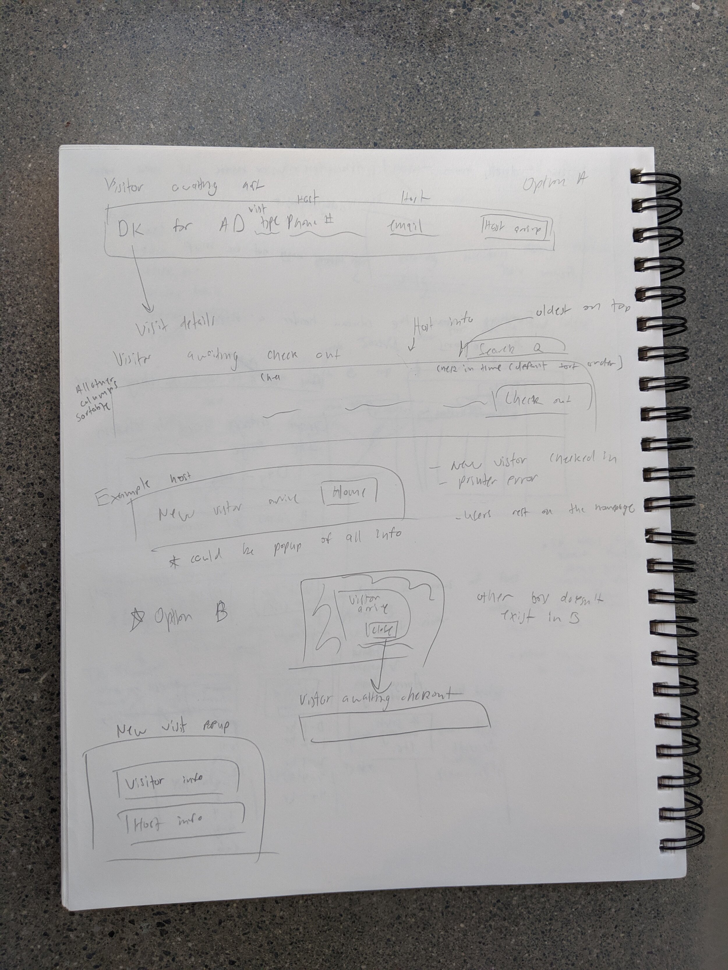
To begin ideation, I collaborated with the creative director to create user stories based on his knowledge of what the user pain points might be. We coupled these user stories with the common features and set of requirements from the research phase to create a site map of the pages that would be included in the website and the hierarchy that they would follow. From here we created some high level sketches before I began wireframing in InDesign.


Design
With the user needs in mind along with the sketches and general concepts that I produced during ideation, I began wireframing pages. Every week I had a set of pages whose design I prioritized and I would meet with stakeholders every week to receive their feedback and iterate. This continued until we had a wireframe for every page in the sitemap and the wireframes were comprehensive enough that we could pass them to a visual designer. From there the visual designer would create high-fidelity mockups that could be passed to development.
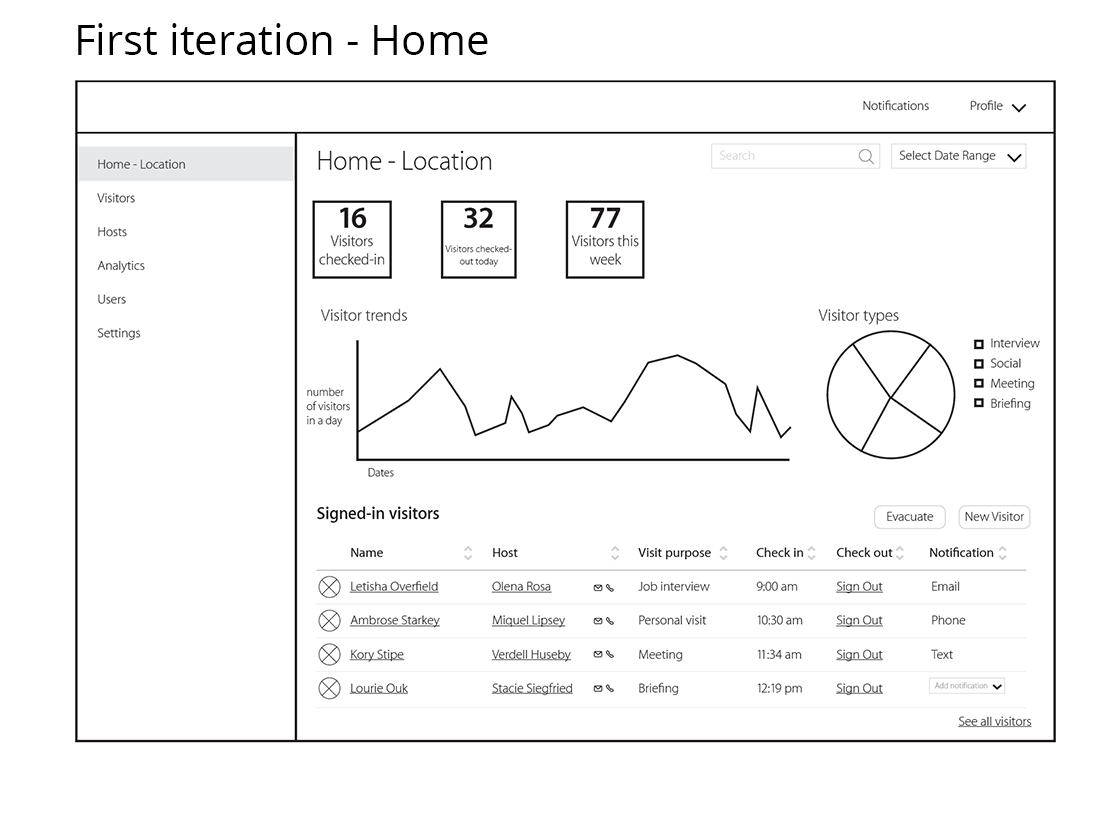
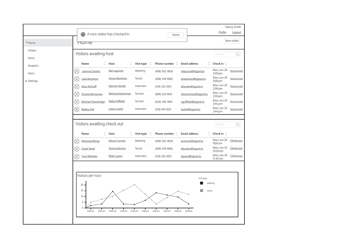
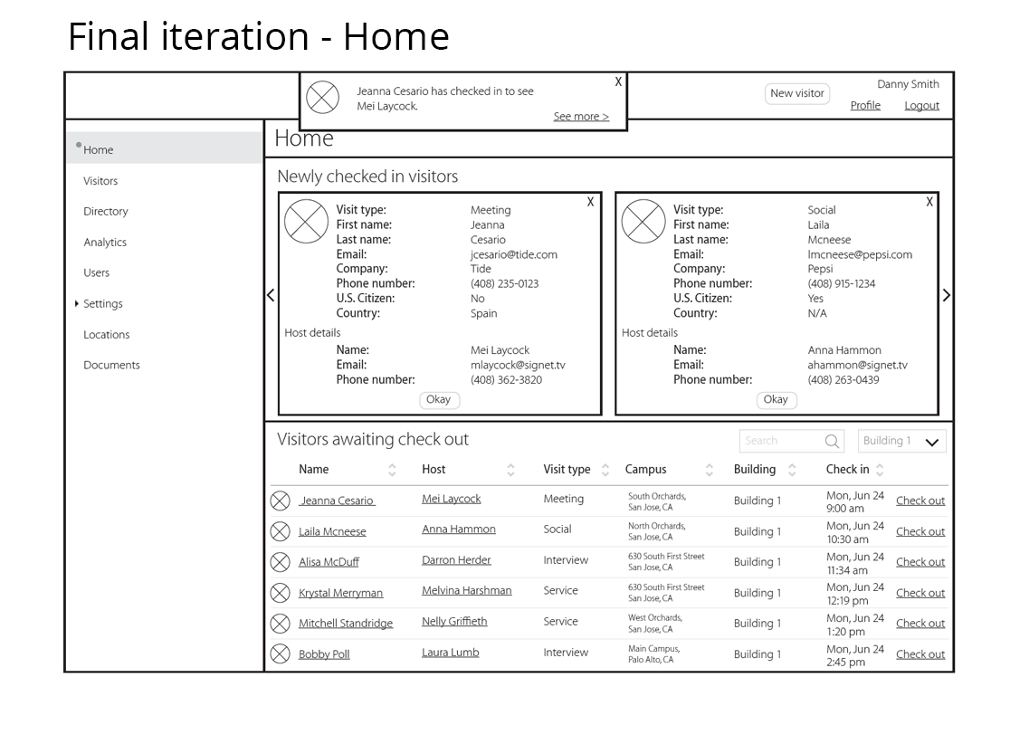
As design progressed, the homepage was refined to focus on the needs of a role like a receptionist. This first page surfaces information and features that they are most likely to utilize for the day-to-day functions.
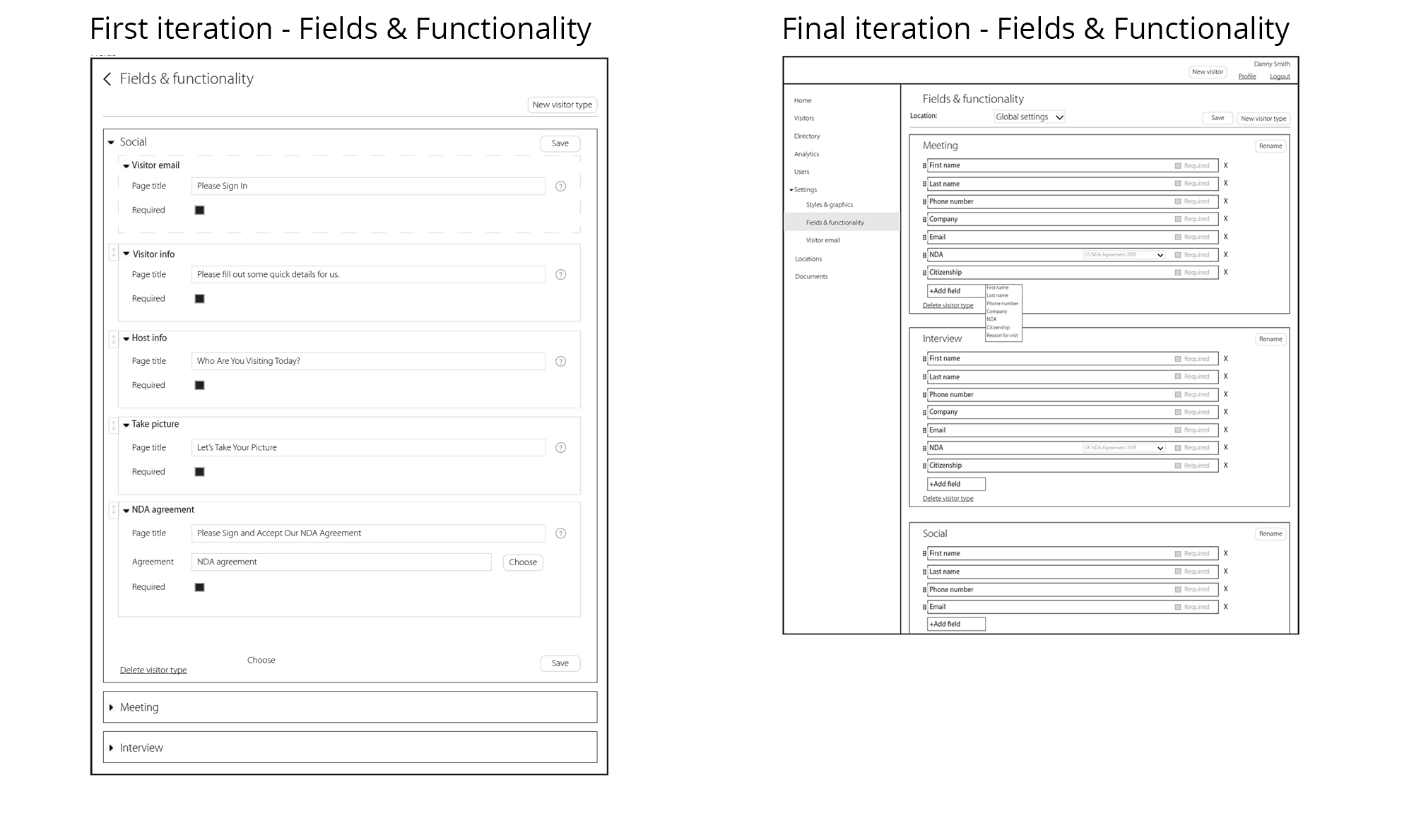
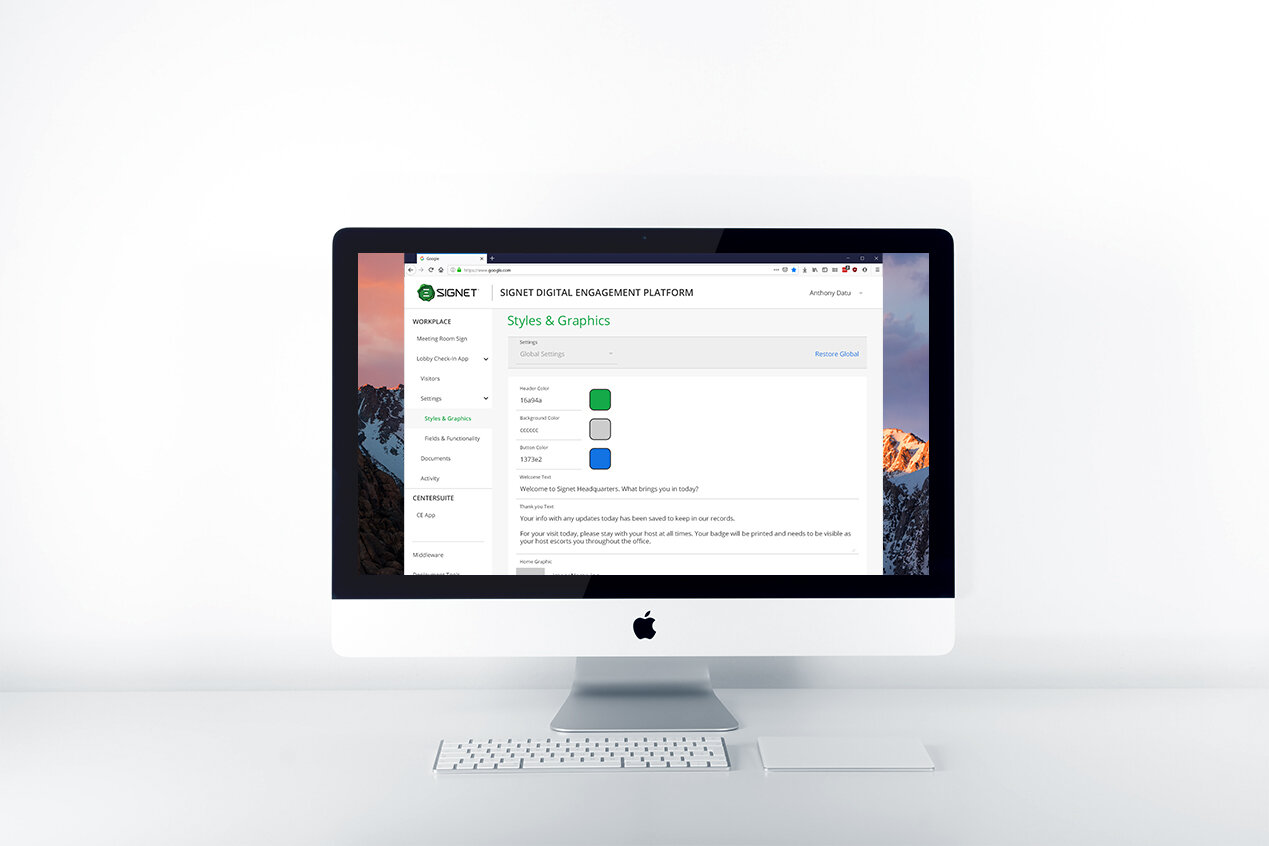
The original purpose of this ‘Fields & Functionality” page was to give users form field text customization and if that step would be required for sign in or not. Throughout the design process, we decided that field names would be static and users would only be able to rearrange and toggle fields. The rationale for this is that we do not anticipate users to change form text.
Visual design
Upon completion of the user experience design and delivery of the low-fidelity wireframes from InDesign, a visual designer on the team began creating high fidelity mockups. Along the way, I worked with the designer to define additional functions and how we could best visually communicate to users the interactions and features that were available to them.